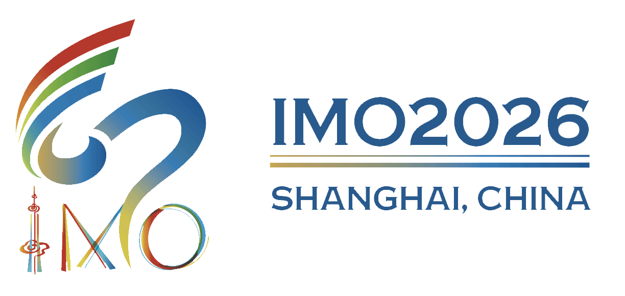
The logo for the 67th International Mathematical Olympiad (IMO) in 2026 is composed of two main sections:
The upper section features a Möbius strip racetrack formed using the five colors of the Olympic rings. The flowing curves not only shape the number “67,” symbolizing the 67-year journey of the IMO, but also extend into the infinity symbol, representing the boundless nature of mathematics.
The lower section displays the letters “IMO.” The overlapping lines in the Olympic colors highlight the global reach and diversity of mathematics. The interwoven colored lines form the IMO acronym, symbolizing unity and cooperation across five continents, as well as the inclusive, borderless nature of mathematics.
The letter “I” is inspired by the Oriental Pearl Tower, a landmark of Shanghai. Three stylized “auspicious clouds” are positioned at the 1st, 2nd, and 7th points along the “I” (the Oriental Pearl), referencing the binary representation of 67: “67 = (1000011)₂,” in which the digit “1” appears at positions 1, 2, and 7 (an idea contributed by Mr. Yijun Yao from Fudan University).
[Designers: Lingfei Li (Class of 2027, Shanghai High School) and her parent Xiaoyan Zeng; Ruoyi Wei (Chloe Wei) from Class 2(6), Shanghai High School International Division; in collaboration with the Art Department of Shanghai High School]